> For the complete documentation index, see [llms.txt](https://docs.sov.ai/llms.txt). Markdown versions of documentation pages are available by appending `.md` to page URLs; this page is available as [Markdown](https://docs.sov.ai/asset-managment/signal-evaluation.md).
# Signal Evaluation
This module provides a wide array of analytical tools and visualizations to help quantitative analysts and portfolio managers evaluate the quality, consistency, and robustness of their alpha signals.
`Tutorials` are the best documentation — [`Signal Evaluation Tutorial`](https://colab.research.google.com/github/sovai-research/sovai-public/blob/main/notebooks/studies/Signal%20Evaluation.ipynb)
### Key Features
* Comprehensive performance analysis
* Risk-adjusted return metrics
* Stress testing capabilities
* Drawdown analysis
* Return distribution analysis
* Signal persistence evaluation
### Usage
To use the Signal Evaluator, you first need to prepare your signal data. The module expects a DataFrame containing your signal values. Once you have your data ready, you can initialize the Signal Evaluator as follows:
import sovai as sov

# Authenticate
sov.token_auth(token="your_authentication_token")

# Prepare your signal data
df_signal = sov.data("your_signal_data_source")

# Initialize the Signal Evaluator
evaluator = df_signal.signal_evaluator()
## Available Analyses and Visualizations
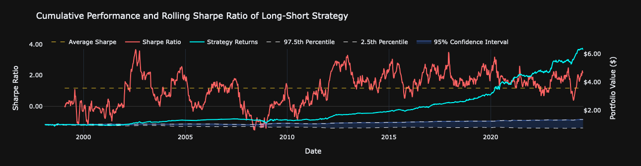
### Performance Plot
This visualization helps in understanding the overall effectiveness of the signal and its risk-adjusted performance over time.
This plot provides a comprehensive view of the signal's performance over time. It includes:
* Cumulative returns of the strategy
* A 95% confidence interval based on random simulations
* A rolling Sharpe ratio on a secondary y-axis
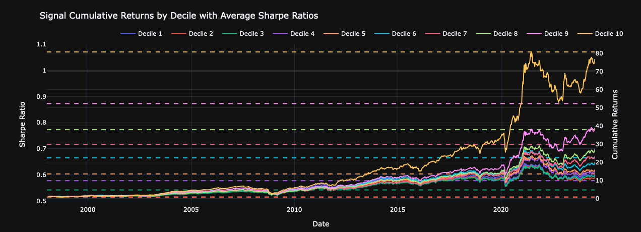
### Signal Decile Plot
This helps in understanding how different levels of the signal correspond to future returns, providing insights into the signal's predictive power across its range.
This plot breaks down the signal's performance by strength, showing:
* Cumulative returns for each signal decile
* Average Sharpe ratios for each decile
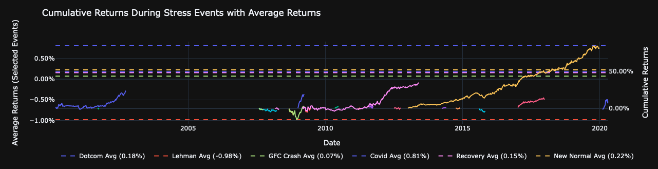
### Stress Test Plot
This visualization shows how the signal performs during various historical market stress events, helping to assess:
* Strategy robustness during market crises
* Potential for drawdowns during extreme market conditions
* Comparative performance against benchmark during stress periods
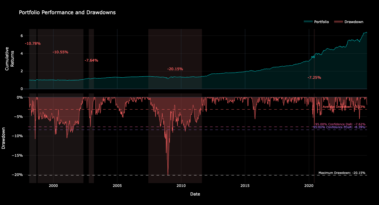
### Drawdown Plot
This plot visualizes the drawdowns of the strategy over time, helping to understand:
* Magnitude of historical drawdowns
* Frequency of drawdowns
* Recovery periods
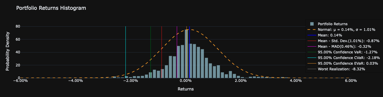
### Return Distribution Plot
This plot helps in understanding the risk profile of the strategy and the likelihood of extreme returns.
This histogram shows the distribution of strategy returns, typically including:
* Mean return
* Standard deviation
* Skewness and kurtosis
* Various risk metrics (e.g., VaR, CVaR)
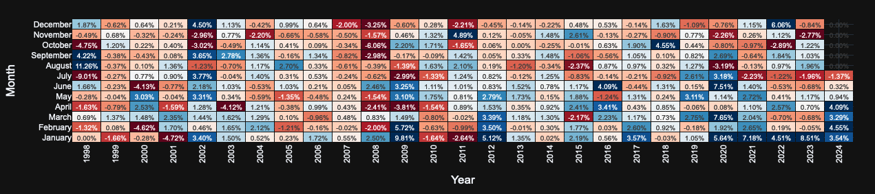
### Returns Heatmap
This heatmap displays strategy returns across different months and years, useful for identifying:
* Seasonal patterns in performance
* Consistency of returns over time
* Years or months of outperformance/underperformance
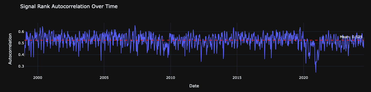
### Signal Autocorrelation Plot
This plot shows the autocorrelation of the signal over time, providing insights into:
* Signal persistence
* Potential for mean reversion
* Optimal holding periods
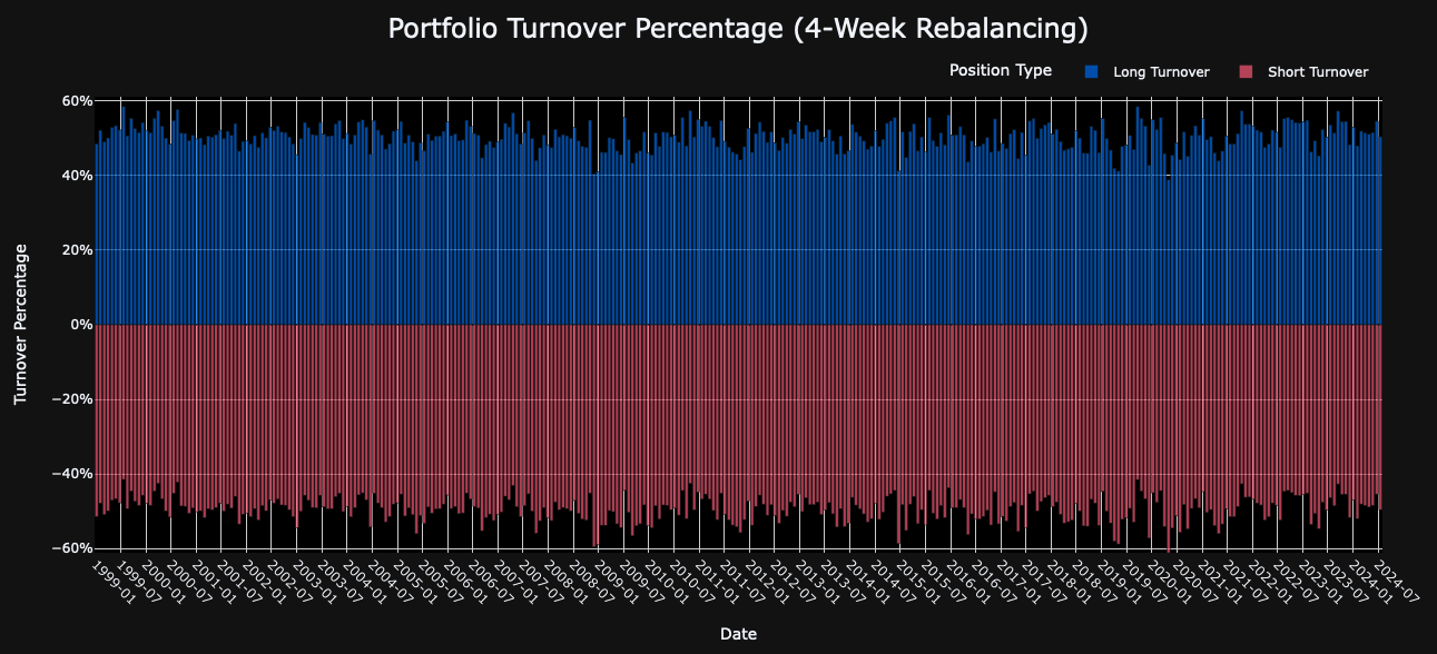
### Portfolio Turnover Plot
This visualization depicts portfolio turnover over time, separated into long and short positions. It helps in assessing:
* Trading costs
* Strategy stability
* Potential capacity constraints
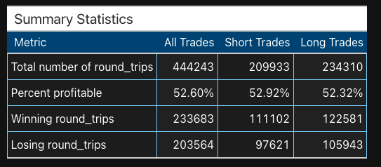
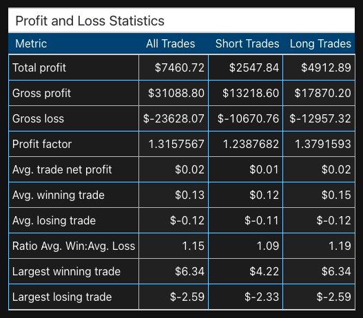
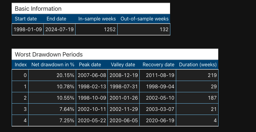
### Performance Statistics Table
This table provides detailed information about the worst drawdown periods, including:
* Drawdown magnitude
* Duration of drawdowns
* Recovery times
### Other Core Attributes
The Signal Evaluator also provides access to several core attributes for further analysis:
1. `evaluator.positions`: Initial portfolio holdings derived from the signal
2. `evaluator.rebalance_mask`: Boolean mask indicating rebalancing schedule
3. `evaluator.holdings`: Actual portfolio holdings after applying rebalancing
4. `evaluator.returns`: Returns of the underlying assets
5. `evaluator.position_returns`: Returns of the portfolio positions
6. `evaluator.resampled_returns`: Returns resampled to match rebalancing frequency
7. `evaluator.portfolio_returns`: Aggregate portfolio returns
8. `evaluator.cumulative_returns`: Cumulative performance of the portfolio
[^1]: Class Module
[^2]: class module
[^3]: class module